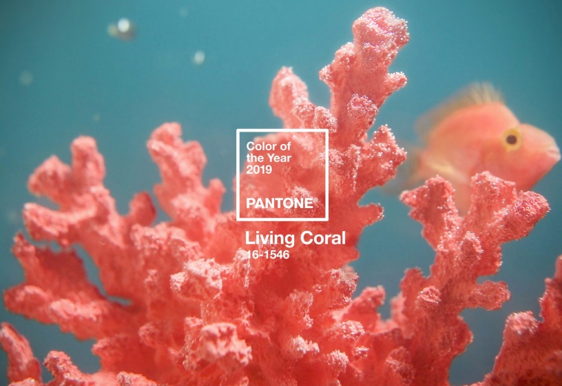
Living Coral, The Color That Draws Attention...
Pantone, the American company well known to graphic designers, which lists no less than 999 shades in its colour chart, has been parodied and has been able to retaliate. A creative battle through colours, for a good cause.
The protection of coral reefs is more relevant than ever. According to the latest IPCC report, their global surface area could decrease by 70 to 90 % if global warming reaches 1.5°C, and by 99 % if global warming reaches 2°C.
The fragility of coral reefs is definitely creating a buzz. We already told you about Minecraft's "Coral Crafters" campaign in the SUSTAINABILITY #07, it is now a story with a twist around a colour code,the now known Living Coral code, that stirs the world of communication up.
Every year, design enthusiasts look forward to the colour of the year chosen by Pantone. The teams analyse trends, drawing inspiration from their travels, cinema, art, fashion. In 2017, a "refreshing and revitalising green to symbolise new beginnings", in 2018, a "provocative and challenging purple that expresses a visionary thought". And in 2019, the color of the year is called Living Coral: an "invigorating coral shade with golden shades that breathe life and energy into it". The brand presents this colour as reassuring, present in our natural environment and symbolising our innate desire for optimism and joy.
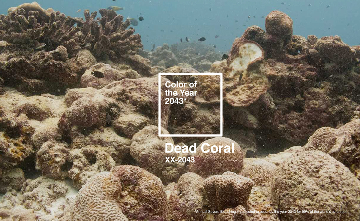
Dead Coral.
Following the report of the United Nations Environment Program which indicates that it is in 2043 that coral reefs are likely to suffer from irreversible bleaching, the advertising agency DDB Chicago has parodied the colour chart. By using all its communication codes, they created the Dead Coral shade, the color of 2043.
And the story doesn't stop there: Pantone, in partnership with Adobe and The Ocean Agency, has recently added three new shades to its color chart: Glowing Blue, Glowing Yellow and Glowing Purple. These are three nuances that reflect the "ecological memory" of coral reefs; some corals react to heat waves and these very bright shades act as sunscreens. "As if the corals were sending a color-coded SOS that says,'Please look at me; I need you to notice it before I disappear'", explains Laurie Pressman, VP of the Pantone Color Institute. This response is accompanied by a creative challenge that invites designers to use these three nuances and all profits from the sale of the Adobe portfolio will be donated to the NGO The Ocean Agency.
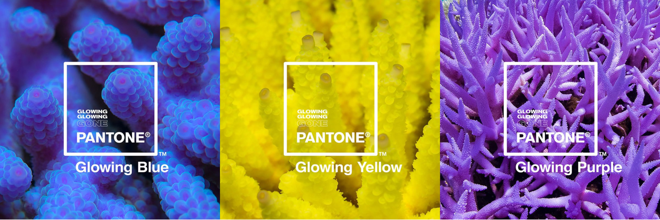
Glowing Blue, Glowing Yellow, Glowing Purple.
A vast awareness campaign between different brands that highlights the seriousness of this phenomenon because when coral reefs will disappear, 25 % of marine life will be deprived of its natural habitat.